Reimagining tendering process app
Reimagining tendering process application by applying a human-centric approach (Proof of Value)
Client
Team
Contribution
Duration
Year
Reimagining tendering process app
Reimagining tendering process application by applying a human-centric approach (Proof of Value)
Client
Team
Contribution
Duration
Year
Reimagining tendering process app
Reimagining tendering process application by applying a human-centric approach (Proof of Value)
Client
Team
Contribution
Duration
Year


Context
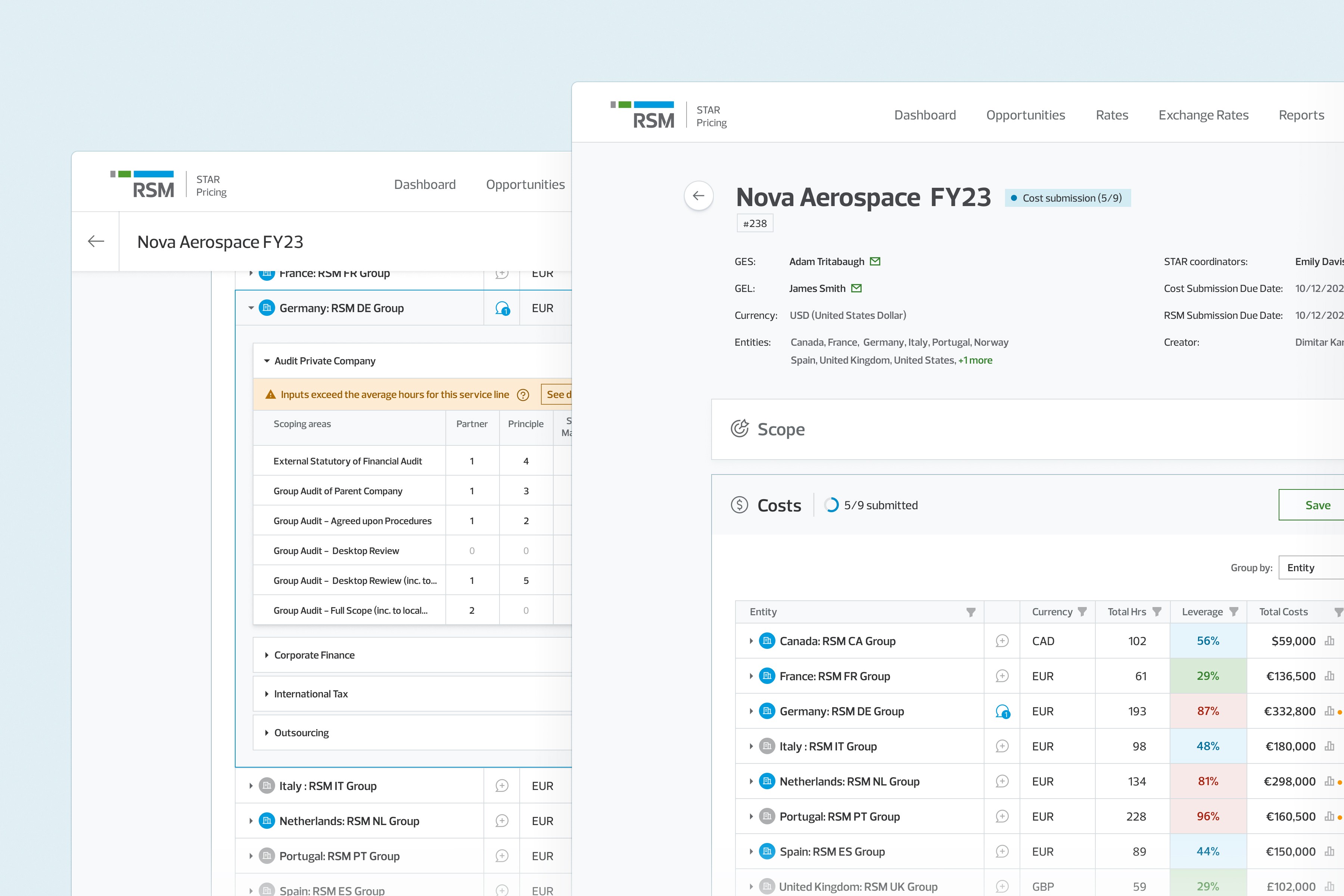
STAR Pricing Model is a handy application RSM Global uses to facilitate the tendering process. The engineering team at Ascent developed it over the past four years using the SharePoint platform. During this time, the team encountered several limitations with SharePoint, so they developed external tools; an example is the PowerBI reports built to meet the analytics needs. As SharePoint 2013 is nearing its end of support, there is a decision to rebuild the STAR app, but there are still two questions before RSM: "What is the best technical solution?" and "What more could the STAR app be to fulfill RSM's needs better?"?
Problem
Today's workflow has proven inefficient, causing a lot of back and forth between the different actors in the process. Users rely on external tools, which makes day-to-day work even more complex. Not only is this wasting a lot of time, but it's also hindering RSM's competitive advantage.
Our Challenge
The six-week time was our biggest challenge; that's why we needed to go heady on the prioritization and to adopt a lean process free of waste
Our team has a six-week timeframe to showcase the superiority of our custom web application over Power Apps, which the client is also considering as an alternative option. What exactly will be in the scope for that three-sprint period was determined by the team's assessment of what will provide the most value. Our aim with this exercise was to present a solution that will inspire excitement and drive to pursue the development of the entire solution. Clearly, this project may not be utilized if the client decides to go in another direction. Nevertheless, this motivated team members to give their best to unlock the full potential of the system they had been building for the past few years.
At a high level, we believed there were three areas in which we could improve on:
Technology: by moving the application to a modern, custom-developed web application
User experience: by centering the process around the user and streamlining it, as well as introducing crucial missing functionalities
Total cost of ownership: by simplified licensing model based on technical consumption and a user provisioning model that is based on existing investments
I will focus on the user experience challenge below.
Discovery & Definition
Discovering the challenges of the users was happening in parallel with my discovery of the system and my challenges with it (as a new joiner)
As I got familiar with the STAR app, I started an inventory of what I noticed and what could be improved regarding flow and UX. This included inconsistent use of elements, accessibility issues and overall confusing aspects of the flow. The new, unbiased sight was handy for uncovering some unintuitive patterns that people got used to. We wanted to witness firsthand how users use the system, see what they struggle with, and hear what functionality they miss and would like to see; therefore, we held four demo and interview sessions with different system users. We also had a workshop with stakeholders regarding the end-to-end RFP process to identify any potential opportunities for integrating tasks currently performed outside of the STAR app into it.
Trade-off: Although four is not ideal for qualitative research, and doesn’t allow us to account for variations and discover patterns, we still gained some valuable insights that boosted our confidence. Recruiting participants is challenging and time-consuming, and finding a suitable number of participants to reach saturation of the insights could take up all of our available time.
Insights
Bid Assistants struggle to track down member firms who haven’t submitted their costs.
The communication is currently taking place through email, resulting in frequent back-and-forth exchanges and context shifting.
Analytics not only help managing partners understand the bigger picture, but they are also useful for Member firm managers to improve the accuracy and speed of their input.
Today’s “Read-only mode” is cumbersome and confusing to users
In reality, three process steps are currently occurring at the same time.
After conducting user interview sessions and collecting a plethora of ideas, the entire team gathered for a prioritization workshop. During this session, we evaluated the effort and value of each idea and determined which ones to focus on until the end of the third sprint.
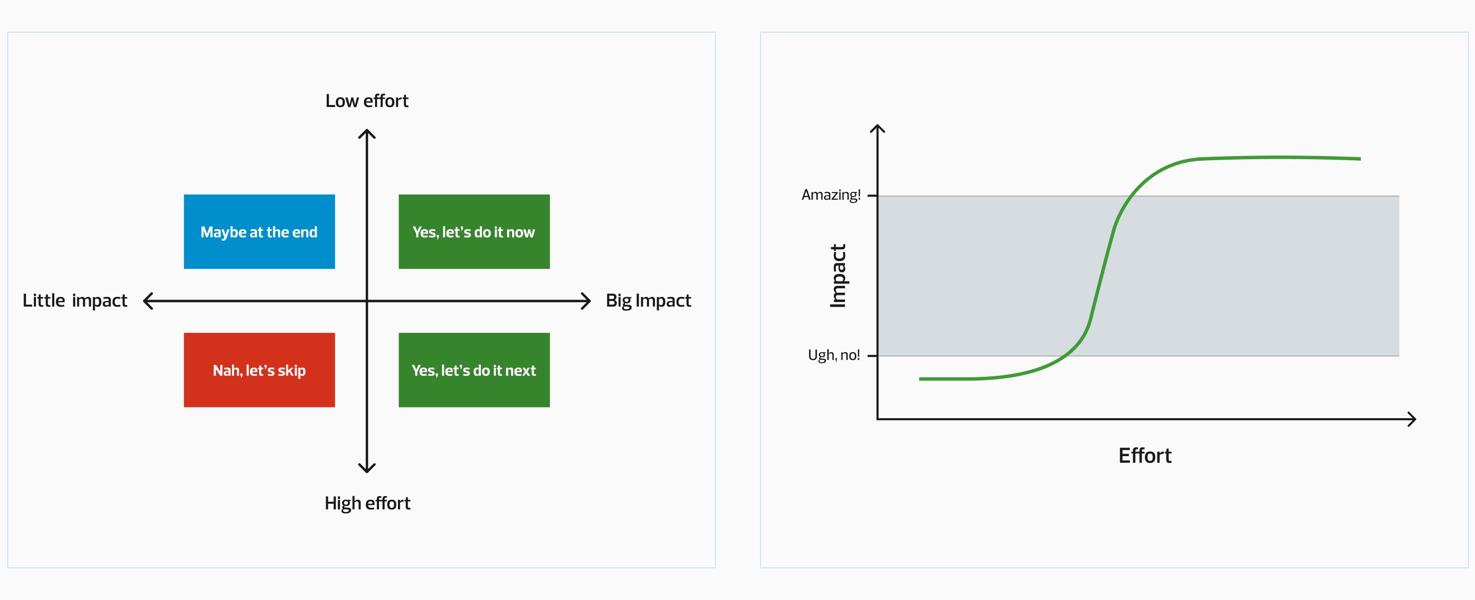
As a result of our prioritization, we have excluded certain sections of the app from our scope because we determined that they would not provide the value and impact we are aiming for.
To understand better who is using the app are we've outlined the main archetypical users and their objectives
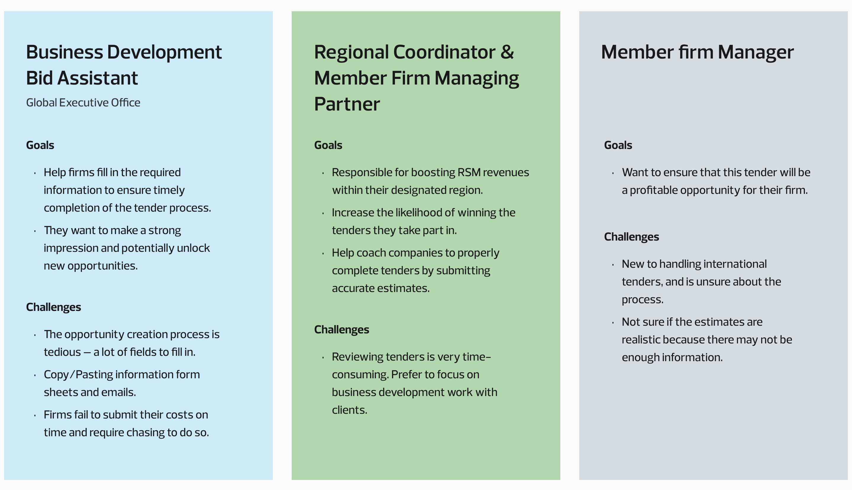
We wanted to tie any feature we will build to one or more of the archetypes above and see how it will improve their life. We've put the highest priority on the Regional Coordinator&Member Firm Managing Partner.
Component library to help us speed up the development and give us advanced grid capabilities
To increase efficiency and deliver valuable results quickly, we have chosen to utilize Telerik Blazor UI. Due to uncertainty surrounding the project's outcome, we have opted for the trial version, which has quite a few limitations in terms of theming.
How will we know we've succeeded?
Since this project is a Proof of Value and we aim to prioritize a human-centric approach. Therefore, we have chosen to use UX outcomes as our key metrics. Namely: If our team does a great job delivering [feature or capability], whose life will it improve and how?
Ideation & Concept evaluation
We have scheduled daily meetings with the Product Owner to brainstorm ideas, as well as regular ones in the format of "3 amigos" (which includes the PO, Lead Engineer, and Designer). The purpose of these meetings was ensure that the proposed solutions are both viable and feasible.
We had scheduled weekly meetings with the stakeholders (2 of the archetypes were in the room) to demo our concepts, perform fire-second tests on the spot and seek their feedback. We also utilized discounted UX methods such as expert reviews and design critique sessions to evaluate solutions, assess our solutions, and pinpoint potential usability concerns. Throughout the process, my colleagues from the company were there to lend their support.
While relying solely on discounted UX methods isn't ideal, we needed quick ways to identify any potential issues.
Solution
Streamlining the process of multi-party tender pricing can make RSM more efficient in responding to RFPs, and generating opportunities as a whole. This also reduces friction for member firms, engaging them in more user-focused processes aligned with their objectives
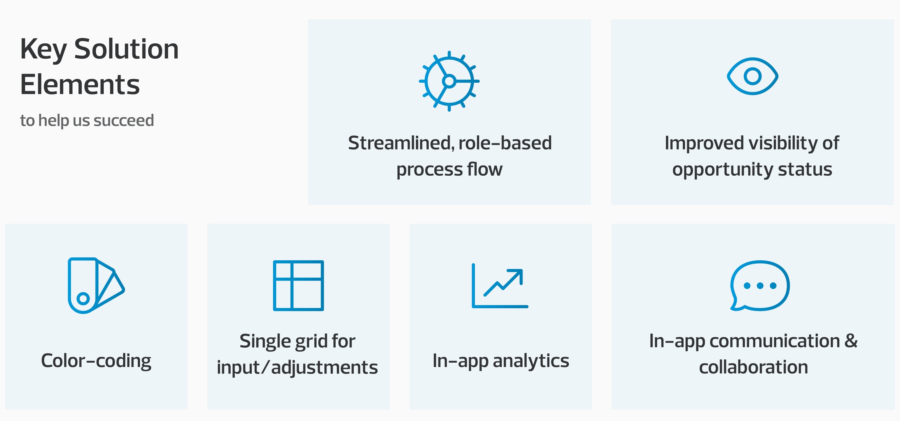
⚙️ Process flow, Statuses & Color-coding improvements
After gathering information from demos, interviews, and analyzing the process flow, we developed a lifecycle map to gain a clearer understanding of each step and user involvement. This aided us in defining the different user journeys.
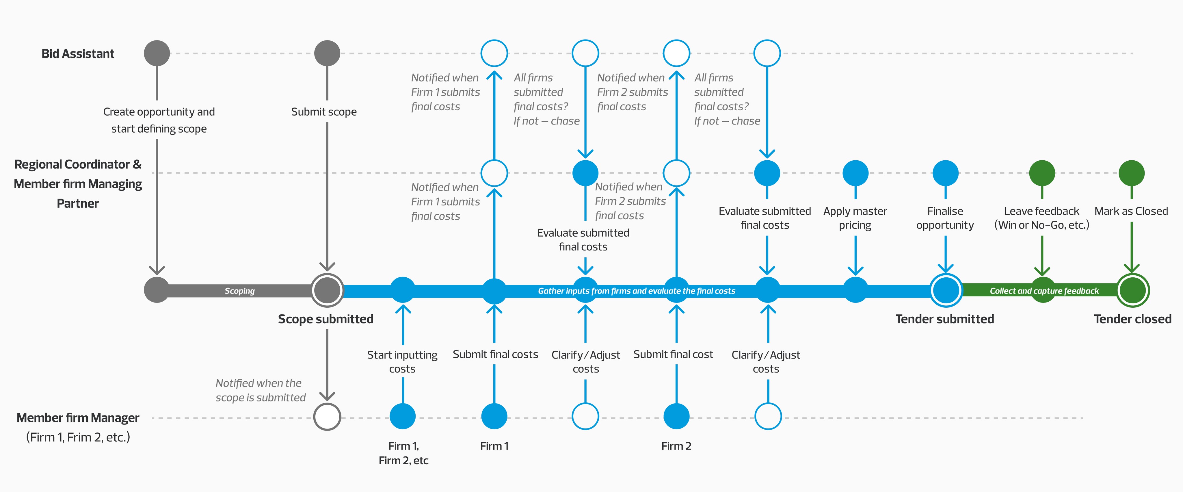
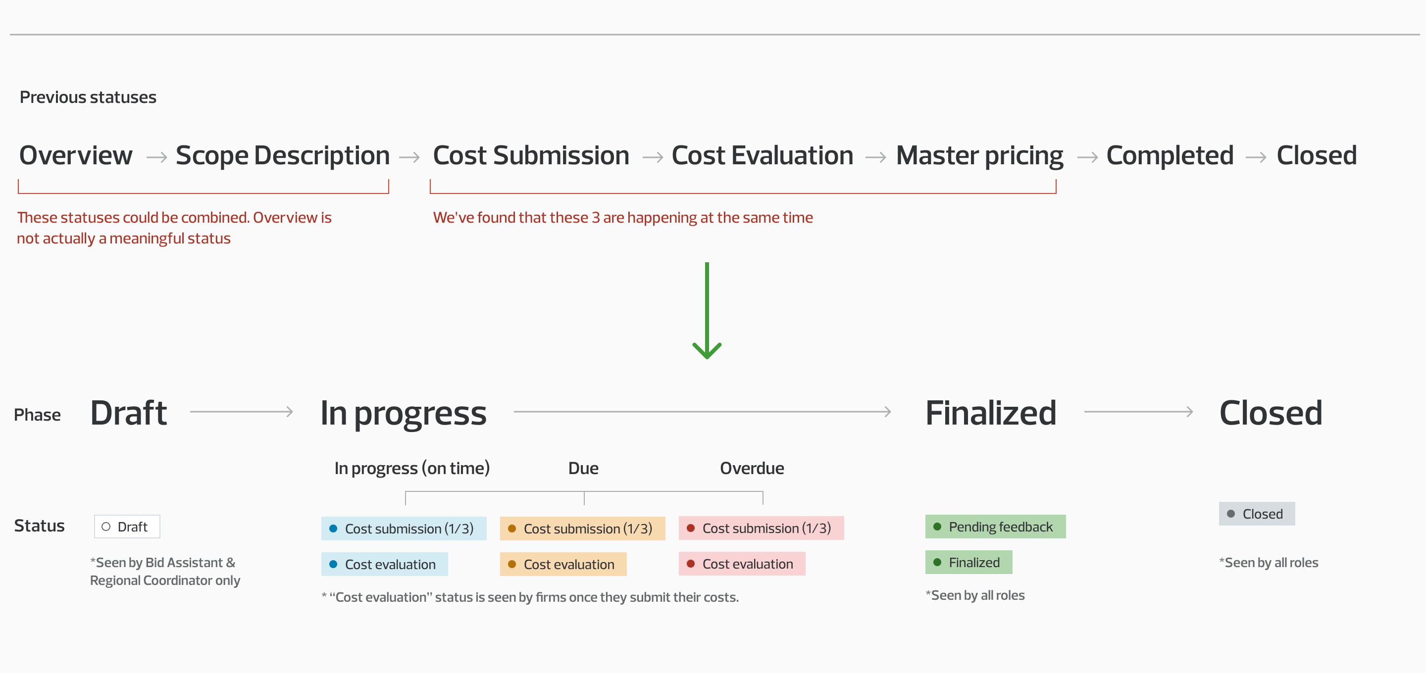
Color-coding made it possible system users to tell the status of an opportunity at a glance. (Before & After)

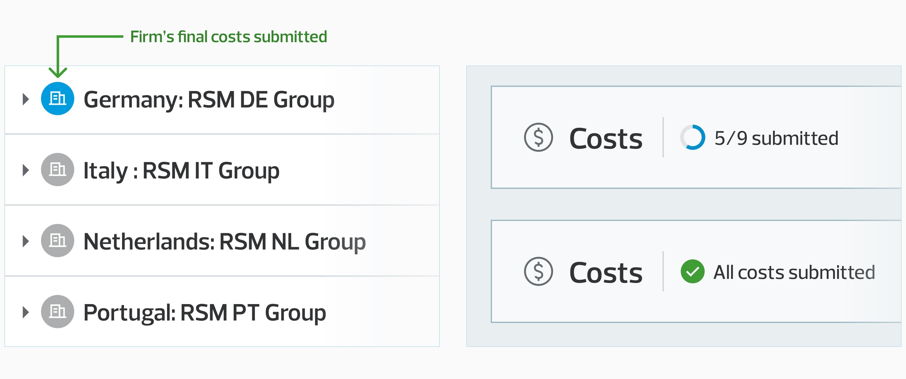
In order to improve communication of progress, we implemented indicators and progress trackers. This feature is especially helpful for the Bid Assistant, who needs to ensure that all firms have submitted their costs on time and follow up with those who haven't.
✏️ Single grid for input and applying adjustments
Through our system demos with users, we have noticed that users often switch between grids on different tabs when assessing costs and making adjustments. Additionally, they frequently press the Save button multiple times before moving away from a tab to prevent data loss.
Our hypothesis is that by providing the single grid for all the operations, we will make the process easier. Combining the grids means that we're moving from tab navigation for the opportunity details screen to collapsable modules representing the different opportunity stages.
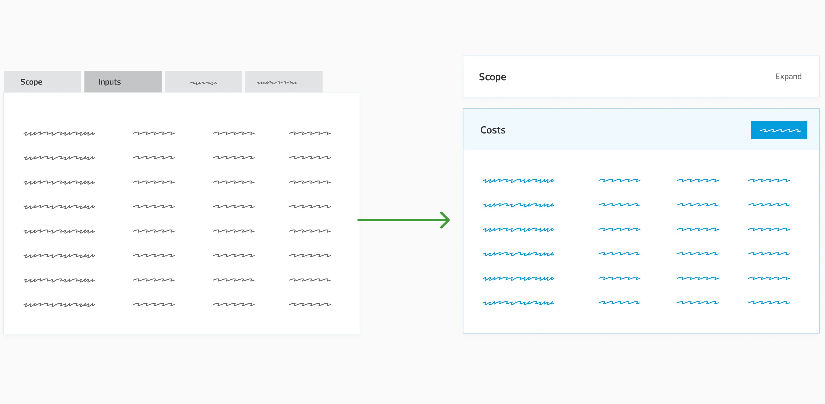
We have successfully merged three separate grids, previously in different tabs, into a single grid. This grid enables firms to enter their costs, which the regional manager reviews. The manager makes necessary adjustments and sets the overall master pricing before submitting the RFP all from one place.

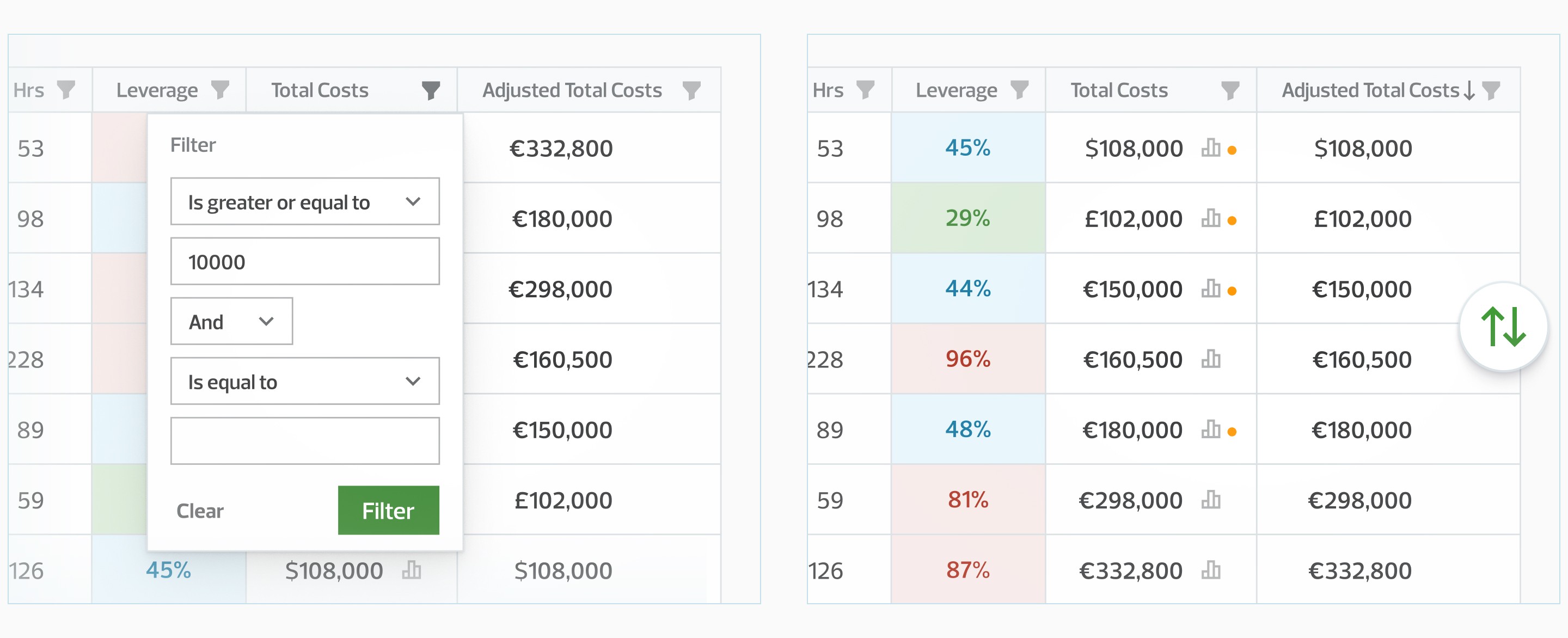
In addition, we have provided advanced filtering and sorting features to assist the Regional Coordinator in narrowing down and arranging the list. These features are readily available with Telerik Blazor UI and were one of the main reasons to go with this particular component library.
📊 Analytics
Understanding the numbers is vital in this game.
The functionality is crucial for two archetypes — the Regional Coordinator and the Managing Partner of the Member firm.
The Regional Coordinator and Managing Partner of the Member firm review costs to identify potential outliers that require specific attention. Inaccurate costs can reduce competitiveness.
The Member Firm Manager needs to compare the current input with the previous submissions of their firm for similar jobs. This comparison helps them improve the accuracy of their cost submissions. We've introduced the "Current vs. Past" section specifically for them.
Trade-off: Although there are valid concerns about using dual-axis graphs, we have chosen to use them due to the need for flexibility in RSM's complex evaluation methods. Moreover, they are familiar to the RSM users who are responsible for assessing costs.
💬 Communication & Collaboration
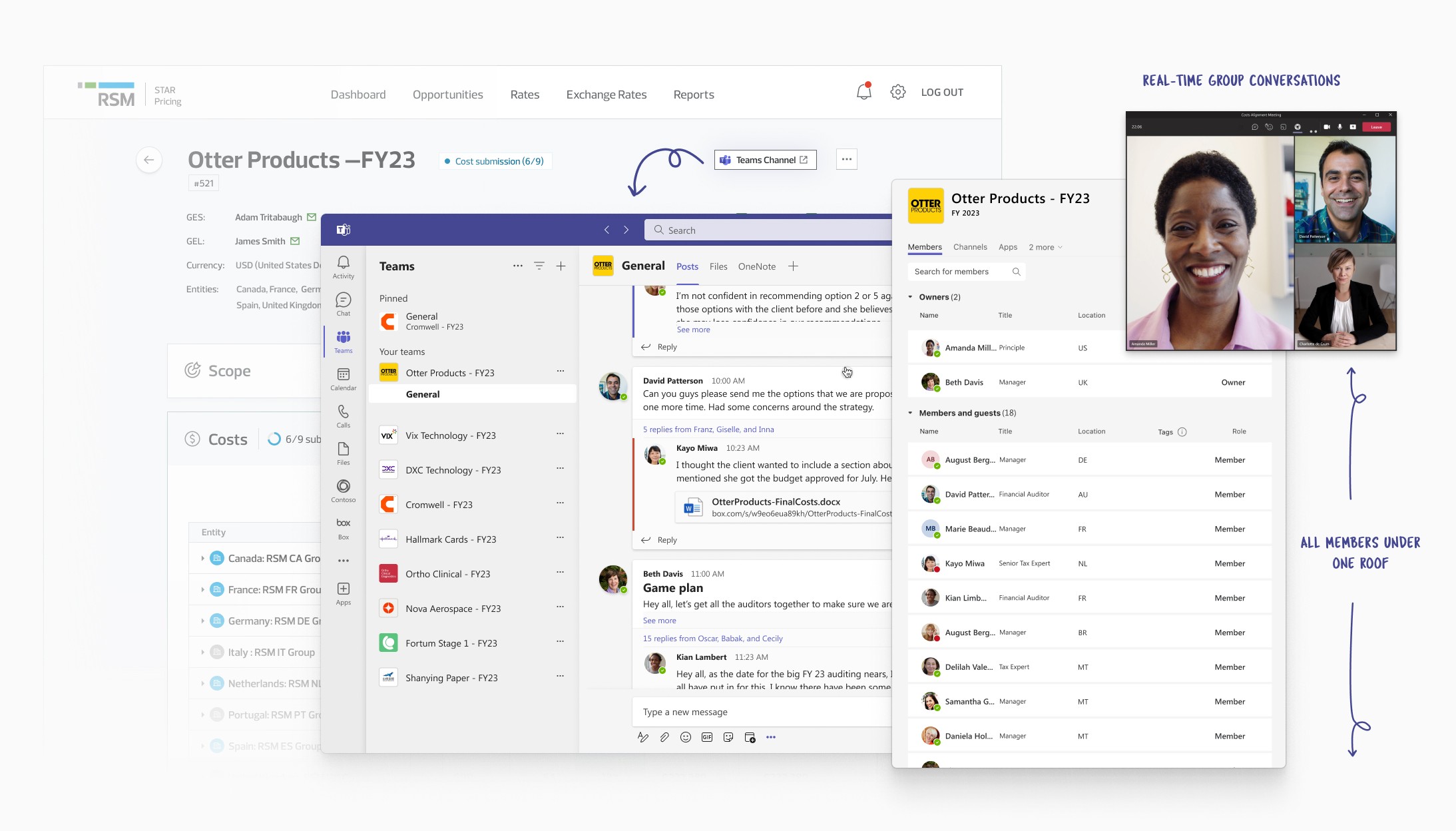
We are bringing the communication in-app and making it contextual. What today is happening via email in multiple threads now is happening next to the corresponding numbers. Notifications further reduce the time needed for back-and-forth communication until the RDF is ready for submission.
Trade-off: In order not to overcomplicate things we kept the communications at the entity (top) level only.
A step further was a concept that we've considered — integrating STAR with Teams.
Takeaways
From this brief yet intense project, I am taking away the following:
Theming a ready-made component library to fit particular branding is more complex and time-consuming than it sounds.
When working under tight restrictions such as limited time or budget, applying a lean approach and utilizing discount UX methods can be help a lot.
Working on strictly impact-oriented project helped me better grasp the idea of prioritization. I can make an anology to this video
If I had the chance...
As a final step before shipping the product, I would work with the PO to define what KPIs that will indicate success of the solution and the numbers that would be considered a success: If this solution is successful we will see:
Here are some metrics I would suggest:
Decrease in the time from the moment the scope is published to the moment when the final costs of all firms are submitted
Increase the number of success turnovers (due to increase competitive advantage)
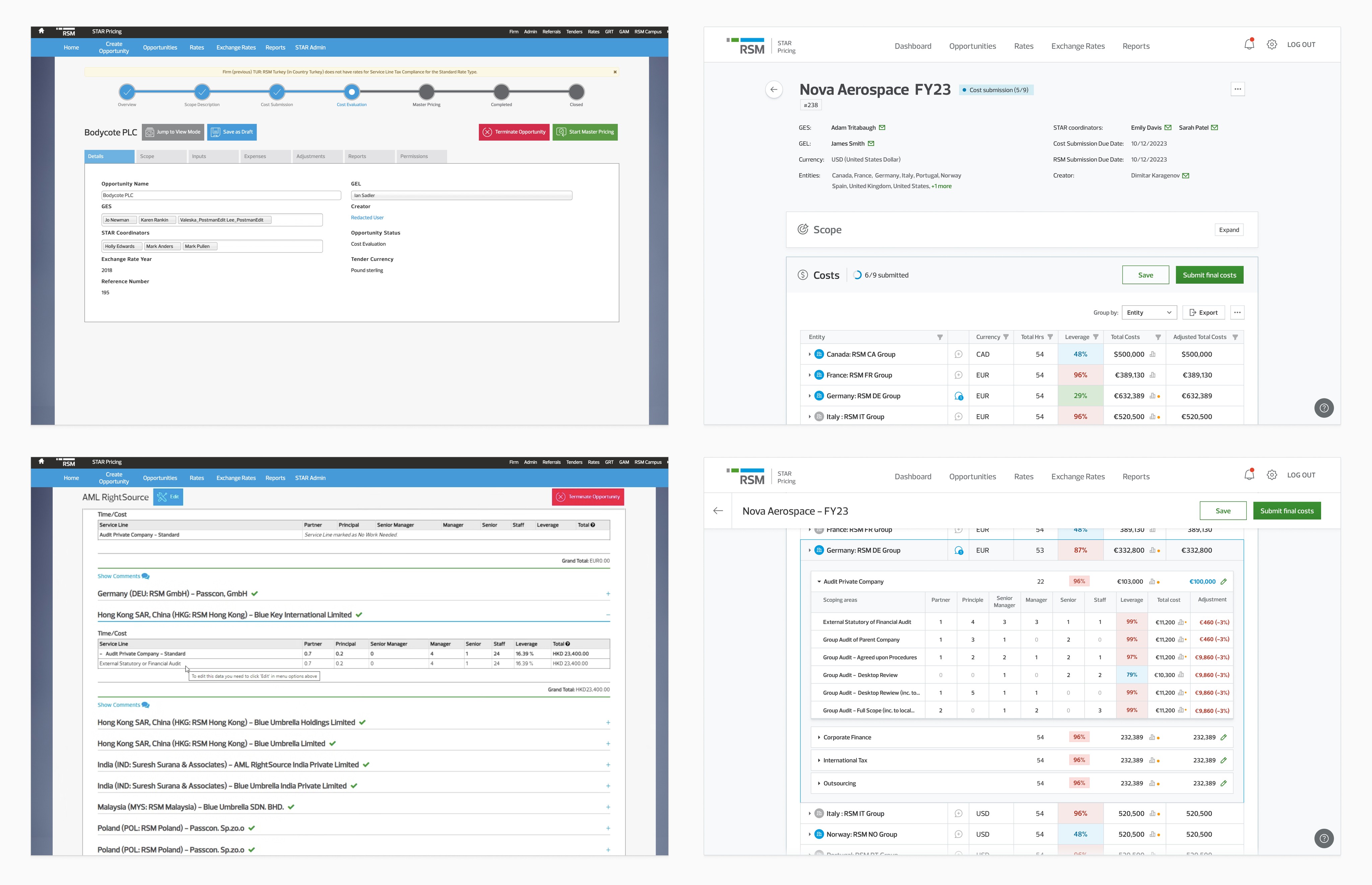
Before & After
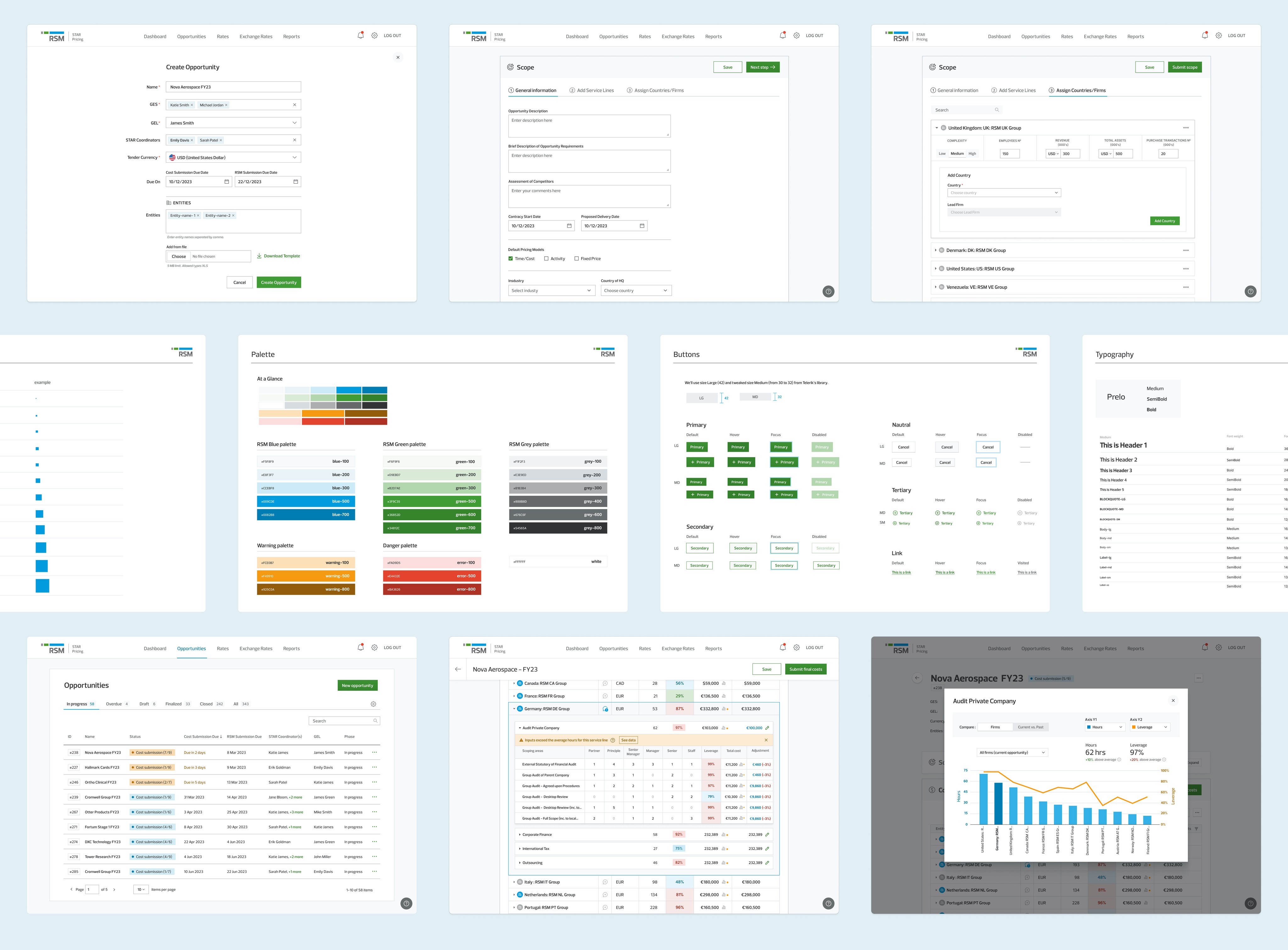
Overview of some of the screens we've created.
🙏 Thank you for reading till the end!
Context
STAR Pricing Model is a handy application RSM Global uses to facilitate the tendering process. The engineering team at Ascent developed it over the past four years using the SharePoint platform. During this time, the team encountered several limitations with SharePoint, so they developed external tools; an example is the PowerBI reports built to meet the analytics needs. As SharePoint 2013 is nearing its end of support, there is a decision to rebuild the STAR app, but there are still two questions before RSM: "What is the best technical solution?" and "What more could the STAR app be to fulfill RSM's needs better?"?
Problem
Today's workflow has proven inefficient, causing a lot of back and forth between the different actors in the process. Users rely on external tools, which makes day-to-day work even more complex. Not only is this wasting a lot of time, but it's also hindering RSM's competitive advantage.
Our Challenge
The six-week time was our biggest challenge; that's why we needed to go heady on the prioritization and to adopt a lean process free of waste
Our team has a six-week timeframe to showcase the superiority of our custom web application over Power Apps, which the client is also considering as an alternative option. What exactly will be in the scope for that three-sprint period was determined by the team's assessment of what will provide the most value. Our aim with this exercise was to present a solution that will inspire excitement and drive to pursue the development of the entire solution. Clearly, this project may not be utilized if the client decides to go in another direction. Nevertheless, this motivated team members to give their best to unlock the full potential of the system they had been building for the past few years.
At a high level, we believed there were three areas in which we could improve on:
Technology: by moving the application to a modern, custom-developed web application
User experience: by centering the process around the user and streamlining it, as well as introducing crucial missing functionalities
Total cost of ownership: by simplified licensing model based on technical consumption and a user provisioning model that is based on existing investments
I will focus on the user experience challenge below.
Discovery & Definition
Discovering the challenges of the users was happening in parallel with my discovery of the system and my challenges with it (as a new joiner)
As I got familiar with the STAR app, I started an inventory of what I noticed and what could be improved regarding flow and UX. This included inconsistent use of elements, accessibility issues and overall confusing aspects of the flow. The new, unbiased sight was handy for uncovering some unintuitive patterns that people got used to. We wanted to witness firsthand how users use the system, see what they struggle with, and hear what functionality they miss and would like to see; therefore, we held four demo and interview sessions with different system users. We also had a workshop with stakeholders regarding the end-to-end RFP process to identify any potential opportunities for integrating tasks currently performed outside of the STAR app into it.
Trade-off: Although four is not ideal for qualitative research, and doesn’t allow us to account for variations and discover patterns, we still gained some valuable insights that boosted our confidence. Recruiting participants is challenging and time-consuming, and finding a suitable number of participants to reach saturation of the insights could take up all of our available time.
Insights
Bid Assistants struggle to track down member firms who haven’t submitted their costs.
The communication is currently taking place through email, resulting in frequent back-and-forth exchanges and context shifting.
Analytics not only help managing partners understand the bigger picture, but they are also useful for Member firm managers to improve the accuracy and speed of their input.
Today’s “Read-only mode” is cumbersome and confusing to users
In reality, three process steps are currently occurring at the same time.
After conducting user interview sessions and collecting a plethora of ideas, the entire team gathered for a prioritization workshop. During this session, we evaluated the effort and value of each idea and determined which ones to focus on until the end of the third sprint.

As a result of our prioritization, we have excluded certain sections of the app from our scope because we determined that they would not provide the value and impact we are aiming for.
To understand better who is using the app are we've outlined the main archetypical users and their objectives

We wanted to tie any feature we will build to one or more of the archetypes above and see how it will improve their life. We've put the highest priority on the Regional Coordinator&Member Firm Managing Partner.
Component library to help us speed up the development and give us advanced grid capabilities
To increase efficiency and deliver valuable results quickly, we have chosen to utilize Telerik Blazor UI. Due to uncertainty surrounding the project's outcome, we have opted for the trial version, which has quite a few limitations in terms of theming.
How will we know we've succeeded?
Since this project is a Proof of Value and we aim to prioritize a human-centric approach. Therefore, we have chosen to use UX outcomes as our key metrics. Namely: If our team does a great job delivering [feature or capability], whose life will it improve and how?
Ideation & Concept evaluation
We have scheduled daily meetings with the Product Owner to brainstorm ideas, as well as regular ones in the format of "3 amigos" (which includes the PO, Lead Engineer, and Designer). The purpose of these meetings was ensure that the proposed solutions are both viable and feasible.
We had scheduled weekly meetings with the stakeholders (2 of the archetypes were in the room) to demo our concepts, perform fire-second tests on the spot and seek their feedback. We also utilized discounted UX methods such as expert reviews and design critique sessions to evaluate solutions, assess our solutions, and pinpoint potential usability concerns. Throughout the process, my colleagues from the company were there to lend their support.
While relying solely on discounted UX methods isn't ideal, we needed quick ways to identify any potential issues.
Solution
Streamlining the process of multi-party tender pricing can make RSM more efficient in responding to RFPs, and generating opportunities as a whole. This also reduces friction for member firms, engaging them in more user-focused processes aligned with their objectives

⚙️ Process flow, Statuses & Color-coding improvements
After gathering information from demos, interviews, and analyzing the process flow, we developed a lifecycle map to gain a clearer understanding of each step and user involvement. This aided us in defining the different user journeys.


Color-coding made it possible system users to tell the status of an opportunity at a glance. (Before & After)

In order to improve communication of progress, we implemented indicators and progress trackers. This feature is especially helpful for the Bid Assistant, who needs to ensure that all firms have submitted their costs on time and follow up with those who haven't.

✏️ Single grid for input and applying adjustments
Through our system demos with users, we have noticed that users often switch between grids on different tabs when assessing costs and making adjustments. Additionally, they frequently press the Save button multiple times before moving away from a tab to prevent data loss.
Our hypothesis is that by providing the single grid for all the operations, we will make the process easier. Combining the grids means that we're moving from tab navigation for the opportunity details screen to collapsable modules representing the different opportunity stages.

We have successfully merged three separate grids, previously in different tabs, into a single grid. This grid enables firms to enter their costs, which the regional manager reviews. The manager makes necessary adjustments and sets the overall master pricing before submitting the RFP all from one place.

In addition, we have provided advanced filtering and sorting features to assist the Regional Coordinator in narrowing down and arranging the list. These features are readily available with Telerik Blazor UI and were one of the main reasons to go with this particular component library.

📊 Analytics
Understanding the numbers is vital in this game.
The functionality is crucial for two archetypes — the Regional Coordinator and the Managing Partner of the Member firm.
The Regional Coordinator and Managing Partner of the Member firm review costs to identify potential outliers that require specific attention. Inaccurate costs can reduce competitiveness.
The Member Firm Manager needs to compare the current input with the previous submissions of their firm for similar jobs. This comparison helps them improve the accuracy of their cost submissions. We've introduced the "Current vs. Past" section specifically for them.
Trade-off: Although there are valid concerns about using dual-axis graphs, we have chosen to use them due to the need for flexibility in RSM's complex evaluation methods. Moreover, they are familiar to the RSM users who are responsible for assessing costs.
💬 Communication & Collaboration
We are bringing the communication in-app and making it contextual. What today is happening via email in multiple threads now is happening next to the corresponding numbers. Notifications further reduce the time needed for back-and-forth communication until the RDF is ready for submission.
Trade-off: In order not to overcomplicate things we kept the communications at the entity (top) level only.
A step further was a concept that we've considered — integrating STAR with Teams.

Takeaways
From this brief yet intense project, I am taking away the following:
Theming a ready-made component library to fit particular branding is more complex and time-consuming than it sounds.
When working under tight restrictions such as limited time or budget, applying a lean approach and utilizing discount UX methods can be help a lot.
Working on strictly impact-oriented project helped me better grasp the idea of prioritization. I can make an anology to this video
If I had the chance...
As a final step before shipping the product, I would work with the PO to define what KPIs that will indicate success of the solution and the numbers that would be considered a success: If this solution is successful we will see:
Here are some metrics I would suggest:
Decrease in the time from the moment the scope is published to the moment when the final costs of all firms are submitted
Increase the number of success turnovers (due to increase competitive advantage)
Before & After

Overview of some of the screens we've created.

🙏 Thank you for reading till the end!
Context
STAR Pricing Model is a handy application RSM Global uses to facilitate the tendering process. The engineering team at Ascent developed it over the past four years using the SharePoint platform. During this time, the team encountered several limitations with SharePoint, so they developed external tools; an example is the PowerBI reports built to meet the analytics needs. As SharePoint 2013 is nearing its end of support, there is a decision to rebuild the STAR app, but there are still two questions before RSM: "What is the best technical solution?" and "What more could the STAR app be to fulfill RSM's needs better?"?
Problem
Today's workflow has proven inefficient, causing a lot of back and forth between the different actors in the process. Users rely on external tools, which makes day-to-day work even more complex. Not only is this wasting a lot of time, but it's also hindering RSM's competitive advantage.
Our Challenge
The six-week time was our biggest challenge; that's why we needed to go heady on the prioritization and to adopt a lean process free of waste
Our team has a six-week timeframe to showcase the superiority of our custom web application over Power Apps, which the client is also considering as an alternative option. What exactly will be in the scope for that three-sprint period was determined by the team's assessment of what will provide the most value. Our aim with this exercise was to present a solution that will inspire excitement and drive to pursue the development of the entire solution. Clearly, this project may not be utilized if the client decides to go in another direction. Nevertheless, this motivated team members to give their best to unlock the full potential of the system they had been building for the past few years.
At a high level, we believed there were three areas in which we could improve on:
Technology: by moving the application to a modern, custom-developed web application
User experience: by centering the process around the user and streamlining it, as well as introducing crucial missing functionalities
Total cost of ownership: by simplified licensing model based on technical consumption and a user provisioning model that is based on existing investments
I will focus on the user experience challenge below.
Discovery & Definition
Discovering the challenges of the users was happening in parallel with my discovery of the system and my challenges with it (as a new joiner)
As I got familiar with the STAR app, I started an inventory of what I noticed and what could be improved regarding flow and UX. This included inconsistent use of elements, accessibility issues and overall confusing aspects of the flow. The new, unbiased sight was handy for uncovering some unintuitive patterns that people got used to. We wanted to witness firsthand how users use the system, see what they struggle with, and hear what functionality they miss and would like to see; therefore, we held four demo and interview sessions with different system users. We also had a workshop with stakeholders regarding the end-to-end RFP process to identify any potential opportunities for integrating tasks currently performed outside of the STAR app into it.
Trade-off: Although four is not ideal for qualitative research, and doesn’t allow us to account for variations and discover patterns, we still gained some valuable insights that boosted our confidence. Recruiting participants is challenging and time-consuming, and finding a suitable number of participants to reach saturation of the insights could take up all of our available time.
Insights
Bid Assistants struggle to track down member firms who haven’t submitted their costs.
The communication is currently taking place through email, resulting in frequent back-and-forth exchanges and context shifting.
Analytics not only help managing partners understand the bigger picture, but they are also useful for Member firm managers to improve the accuracy and speed of their input.
Today’s “Read-only mode” is cumbersome and confusing to users
In reality, three process steps are currently occurring at the same time.
After conducting user interview sessions and collecting a plethora of ideas, the entire team gathered for a prioritization workshop. During this session, we evaluated the effort and value of each idea and determined which ones to focus on until the end of the third sprint.

As a result of our prioritization, we have excluded certain sections of the app from our scope because we determined that they would not provide the value and impact we are aiming for.
To understand better who is using the app are we've outlined the main archetypical users and their objectives

We wanted to tie any feature we will build to one or more of the archetypes above and see how it will improve their life. We've put the highest priority on the Regional Coordinator&Member Firm Managing Partner.
Component library to help us speed up the development and give us advanced grid capabilities
To increase efficiency and deliver valuable results quickly, we have chosen to utilize Telerik Blazor UI. Due to uncertainty surrounding the project's outcome, we have opted for the trial version, which has quite a few limitations in terms of theming.
How will we know we've succeeded?
Since this project is a Proof of Value and we aim to prioritize a human-centric approach. Therefore, we have chosen to use UX outcomes as our key metrics. Namely: If our team does a great job delivering [feature or capability], whose life will it improve and how?
Ideation & Concept evaluation
We have scheduled daily meetings with the Product Owner to brainstorm ideas, as well as regular ones in the format of "3 amigos" (which includes the PO, Lead Engineer, and Designer). The purpose of these meetings was ensure that the proposed solutions are both viable and feasible.
We had scheduled weekly meetings with the stakeholders (2 of the archetypes were in the room) to demo our concepts, perform fire-second tests on the spot and seek their feedback. We also utilized discounted UX methods such as expert reviews and design critique sessions to evaluate solutions, assess our solutions, and pinpoint potential usability concerns. Throughout the process, my colleagues from the company were there to lend their support.
While relying solely on discounted UX methods isn't ideal, we needed quick ways to identify any potential issues.
Solution
Streamlining the process of multi-party tender pricing can make RSM more efficient in responding to RFPs, and generating opportunities as a whole. This also reduces friction for member firms, engaging them in more user-focused processes aligned with their objectives

⚙️ Process flow, Statuses & Color-coding improvements
After gathering information from demos, interviews, and analyzing the process flow, we developed a lifecycle map to gain a clearer understanding of each step and user involvement. This aided us in defining the different user journeys.


Color-coding made it possible system users to tell the status of an opportunity at a glance. (Before & After)

In order to improve communication of progress, we implemented indicators and progress trackers. This feature is especially helpful for the Bid Assistant, who needs to ensure that all firms have submitted their costs on time and follow up with those who haven't.

✏️ Single grid for input and applying adjustments
Through our system demos with users, we have noticed that users often switch between grids on different tabs when assessing costs and making adjustments. Additionally, they frequently press the Save button multiple times before moving away from a tab to prevent data loss.
Our hypothesis is that by providing the single grid for all the operations, we will make the process easier. Combining the grids means that we're moving from tab navigation for the opportunity details screen to collapsable modules representing the different opportunity stages.

We have successfully merged three separate grids, previously in different tabs, into a single grid. This grid enables firms to enter their costs, which the regional manager reviews. The manager makes necessary adjustments and sets the overall master pricing before submitting the RFP all from one place.

In addition, we have provided advanced filtering and sorting features to assist the Regional Coordinator in narrowing down and arranging the list. These features are readily available with Telerik Blazor UI and were one of the main reasons to go with this particular component library.

📊 Analytics
Understanding the numbers is vital in this game.
The functionality is crucial for two archetypes — the Regional Coordinator and the Managing Partner of the Member firm.
The Regional Coordinator and Managing Partner of the Member firm review costs to identify potential outliers that require specific attention. Inaccurate costs can reduce competitiveness.
The Member Firm Manager needs to compare the current input with the previous submissions of their firm for similar jobs. This comparison helps them improve the accuracy of their cost submissions. We've introduced the "Current vs. Past" section specifically for them.
Trade-off: Although there are valid concerns about using dual-axis graphs, we have chosen to use them due to the need for flexibility in RSM's complex evaluation methods. Moreover, they are familiar to the RSM users who are responsible for assessing costs.
💬 Communication & Collaboration
We are bringing the communication in-app and making it contextual. What today is happening via email in multiple threads now is happening next to the corresponding numbers. Notifications further reduce the time needed for back-and-forth communication until the RDF is ready for submission.
Trade-off: In order not to overcomplicate things we kept the communications at the entity (top) level only.
A step further was a concept that we've considered — integrating STAR with Teams.

Takeaways
From this brief yet intense project, I am taking away the following:
Theming a ready-made component library to fit particular branding is more complex and time-consuming than it sounds.
When working under tight restrictions such as limited time or budget, applying a lean approach and utilizing discount UX methods can be help a lot.
Working on strictly impact-oriented project helped me better grasp the idea of prioritization. I can make an anology to this video
If I had the chance...
As a final step before shipping the product, I would work with the PO to define what KPIs that will indicate success of the solution and the numbers that would be considered a success: If this solution is successful we will see:
Here are some metrics I would suggest:
Decrease in the time from the moment the scope is published to the moment when the final costs of all firms are submitted
Increase the number of success turnovers (due to increase competitive advantage)
Before & After

Overview of some of the screens we've created.

🙏 Thank you for reading till the end!
